Facebook Notify/Getty Images Partnership
Facebook Notify was an experiment that Facebook invited Getty Images to participate in. I was part of the team at Getty Images that designed and build the first image-based news delivery system for the app. We began with 6 channels: News, Sports, Fashion, Eye Candy and Flashback.
Client
Getty Images
Business goals
- For Getty Images to become one of the top content providers within the Notify app
- Showcase the breadth and depth of Getty Images content
- Drive traffic to revenue-generating pages containing advertising
Design goals
- Deliver a suitable payoff when users tap the text notification on their lock screen
- Provide content pivots where appropriate (no dead ends)
- Create a strong visual impact with high quality imagery
Role
I was the UX and visual designer on a team of three developers, one product manager, and a larger editorial/marketing team.
Duration
6 months
Outcomes
During the week of the product launch, we gained over 6000 subscribers. This was how the subscribers broke down into channels.
We were surprised at how many people were interested in Flashback, compared to the other channels. The channel’s main content was archival in nature, and spoke to people’s appreciation for Getty Images’ vast collection of historical imagery. We had assumed that fresh-timely content was going to be the key to gaining users’ attention, and it turned out that the content itself didn’t need to be new, but the key was maintaining relevance.
Background
Facebook’s development of Notify in 2015 coincided nicely with Getty Images ramping up its ambitious consumer program. This program sought to attract the attention of non-creative-industry people who enjoy viewing great imagery and expect it to be both accessible and free. The editorial team had begun to create channels to publish image slideshows that covered everything going on in the world— from street style, to baseball, to earthquakes and beyond.
The new app from Facebook would allow users to subscribe to their preferred topics from trusted news sources and receive brief messages on their mobile phone lock screens. My team designed and built a way for this time-sensitive imagery to be published into image carousels that users could explore further.
Wireframes and user flows
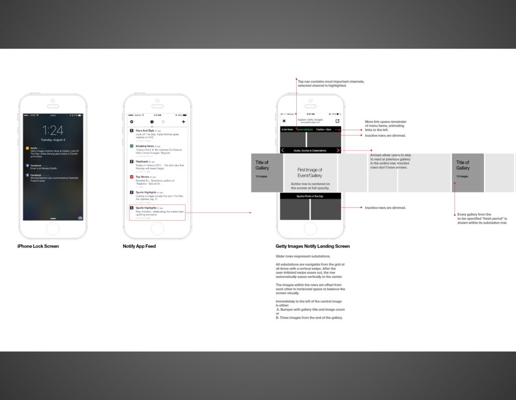
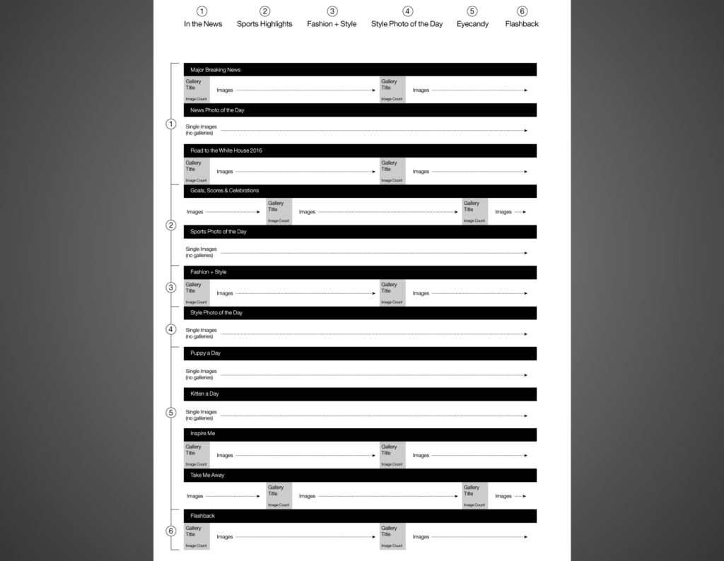
I created user flow wireframes to describe how the experience would play out through the Notify app. This helped the product, content, and development teams visualize how much information would need to appear at every level, and the links between the different areas.
As we were deciding on the types of content that would resonate with subscribers, I diagrammed how the different channels would relate to each other in the omnidirectional grid. This was also where we planned for a flexible hierarchy: some channels would have single images each day, while others would contain sub-sections called galleries.
Storyboards
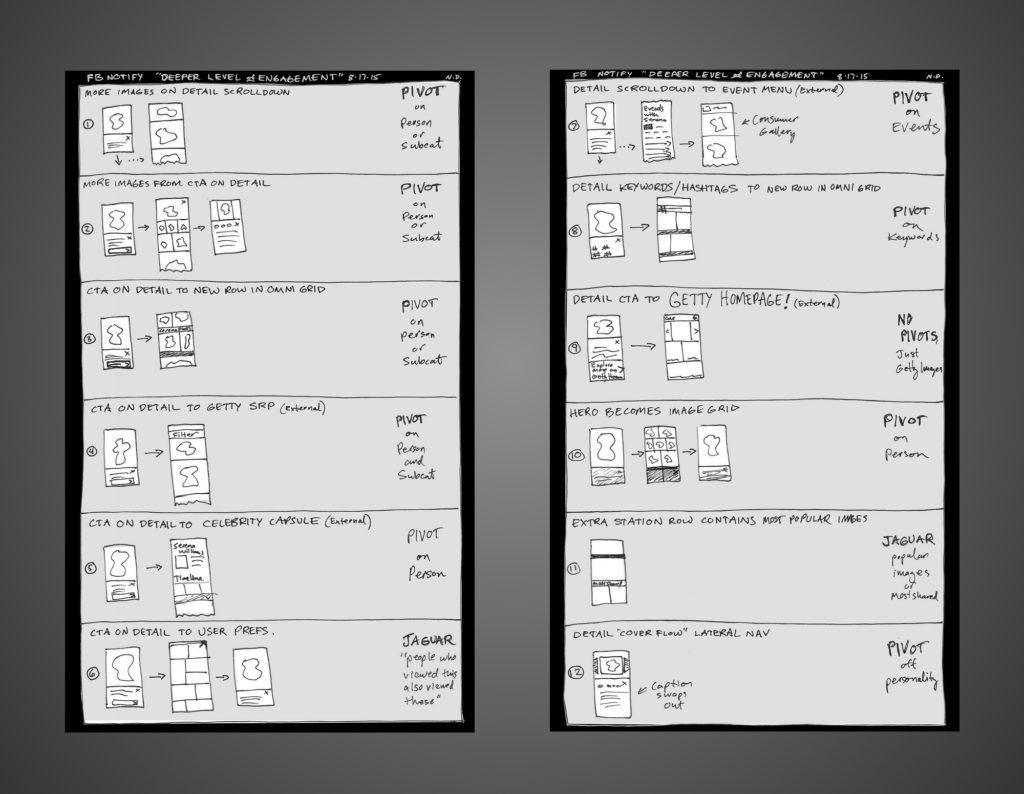
Once the main parts were in place for the app, I brainstormed twelve different ways to provide a deeper level of engagement with the imagery. For an app that would thrive on interrupting people’s day with interesting stories, we had our work cut out for us.
Visual design
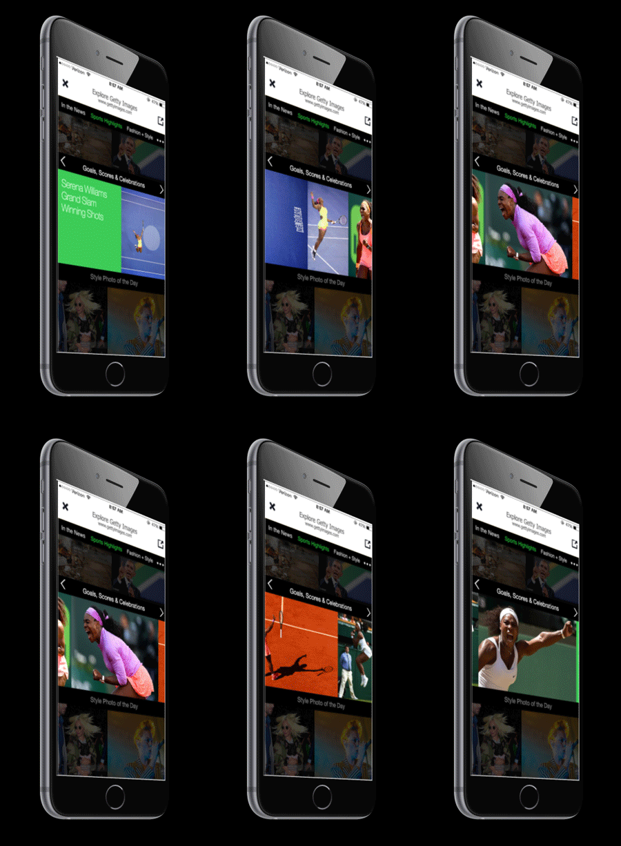
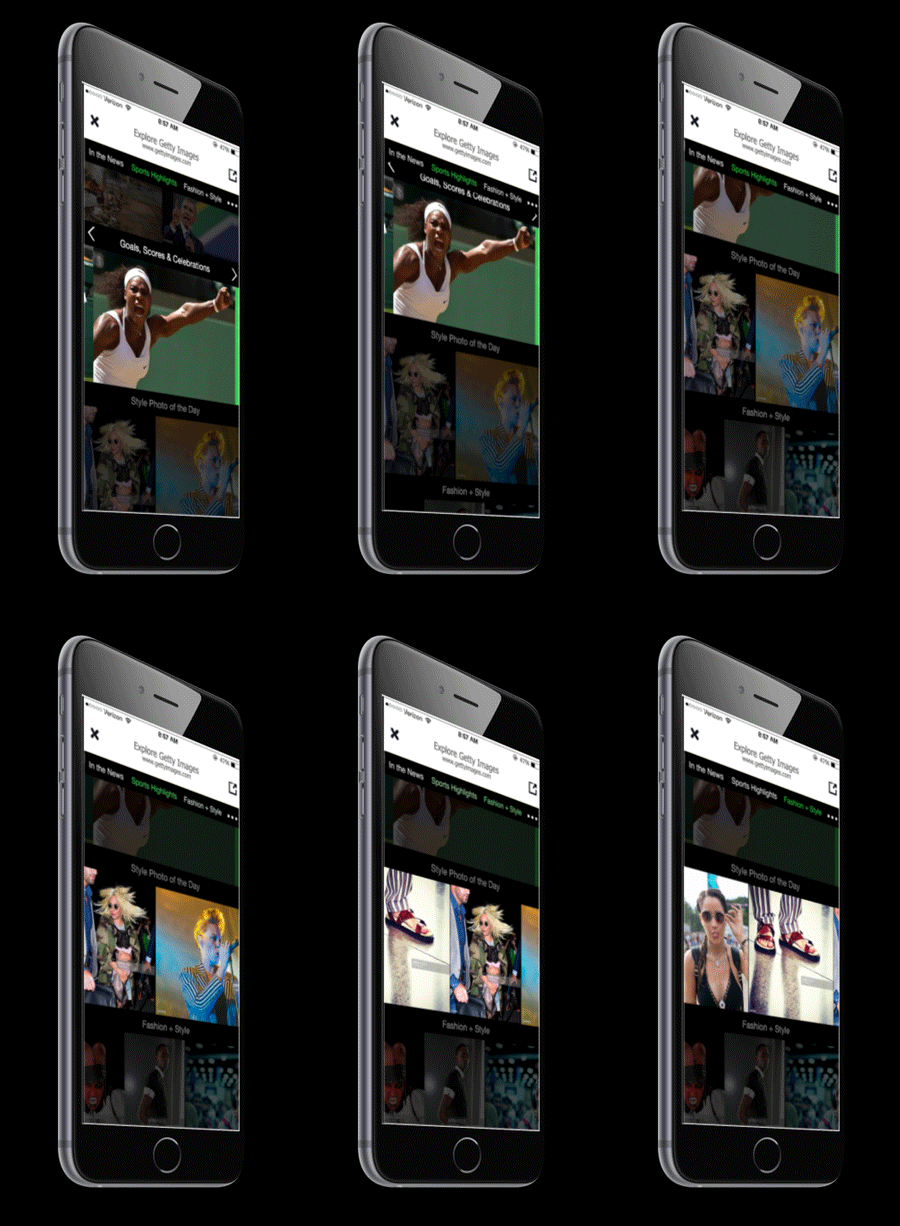
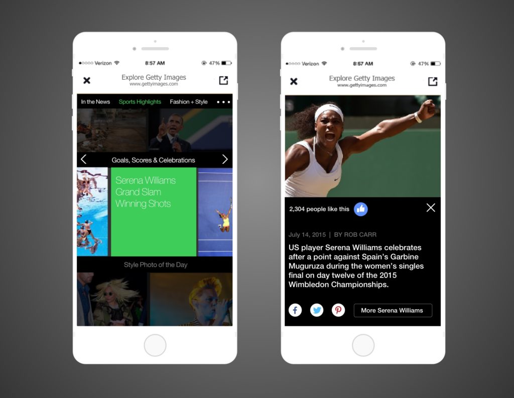
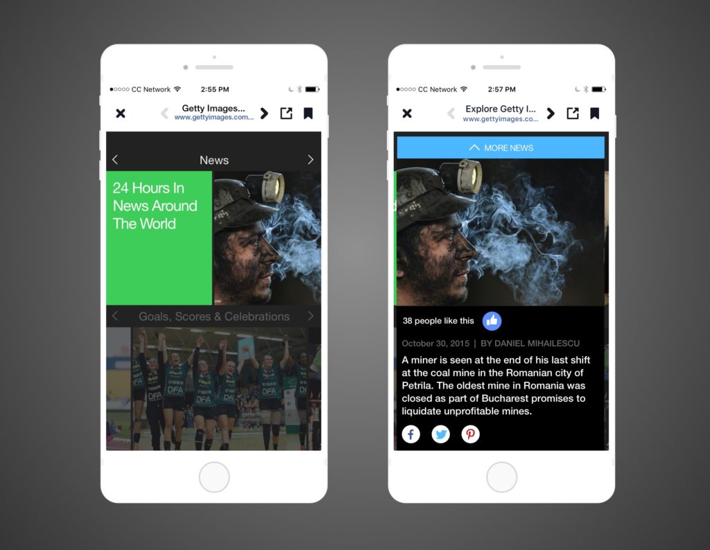
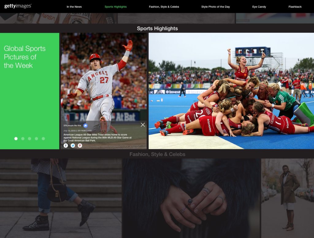
Upon tapping a notification, users would visit a news story contained within an omnidirectional grid.
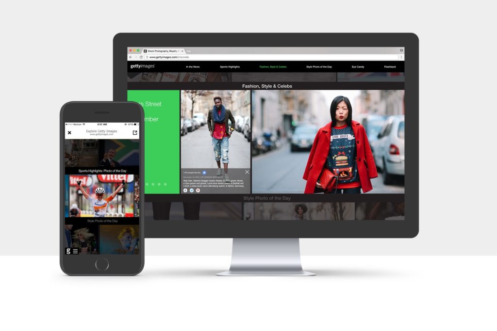
Depending on their interests, users could visit stories told visually for News, Sports, Fashion, Eye Candy and Flashback.
We also created a corresponding desktop viewing experience for users who followed shared content from their social media feeds.


